Netherlands 2026: Hyper Orange and an Iridescent Lion
The Netherlands’ FIFA World Cup 2026 kits reviewed — the vivid “Hyper Crimson” orange home with a color-shifting crest and the gradient-band white away. Ratings & buying.
 Home
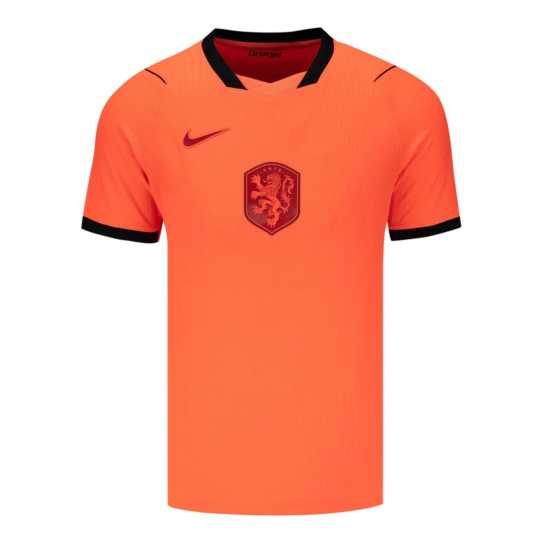
Home
Hyper Crimson orange · black accents · iridescent lion crest
 Away
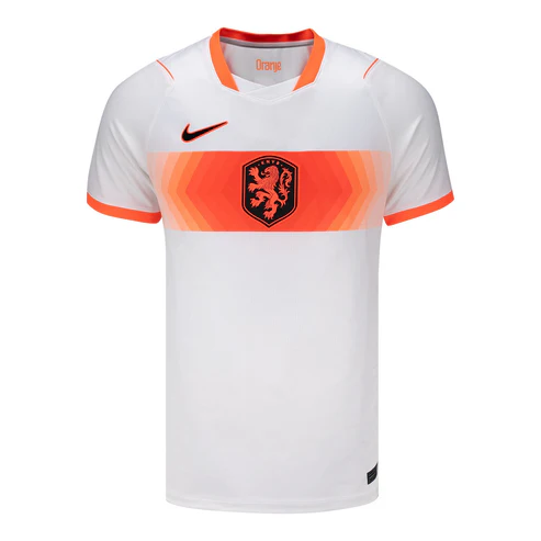
Away
White · orange gradient chest band · microscopic gradients
Original Fanorate review based on publicly reported kit details and football history; AI-assisted and fact-checked against public sources. Official Nike/KNVB kit photos are copyrighted and not reproduced here.
Netherlands

Netherlands 2026 Home Jersey – Men’s (Replica)
FIFA Official Store
Netherlands 2026 Home Authentic Jersey – Men’s
FIFA Official Store
Nike Netherlands Home 2026 Jersey (Replica)
Culto Futbol
Netherlands National Team 2026 Stadium Away
Nike.comThere is no colour in international football quite like Dutch orange.
There is no colour in international football quite like Dutch orange. Oranje isn’t a kit colour so much as a national mood — the shade that turns entire cities into seas of supporters, that means Cruyff and Total Football and the most stylish team never to win the World Cup. When the Netherlands get the orange right, the whole tournament feels brighter.
For 2026, Nike didn’t just get it right — they engineered a brand-new orange to do it. “Hyper Crimson,” reportedly the most vibrant Oranje shade ever, anchors a minimalist home shirt with a clever twist: a crest that literally shifts colour as the players move. It’s a kit built for the camera and the carnival alike.
The colour is the kit
For Dutch fans, orange is identity, joy and history rolled into one. The shirt has to glow — to look as alive as the crowds that wear it. That’s why Nike’s decision to build a custom, hyper-saturated orange feels so on point: it understands that for the Netherlands, the colour is the kit.
The kit at a glance
- Nation
- Netherlands UEFA
- Manufacturer
- Nike
- Home kit
- Bright "Hyper Crimson" orange Black accents; iridescent, color-shifting KNVB lion crest; minimalist, contemporary cut
- Away kit
- White base Horizontal chest band in a vivid gradient of orange tones; subtle orange collar/cuff detailing
- Release window
- Away released Mar 23, 2026 Home revealed earlier in the cycle (check official pages for exact dates)
- Design theme
- Home — most saturated Oranje ever Away — "microscopic gradients," reflecting Dutch experimentation and precision
- Signature detail
- Lenticular, iridescent crest Shifts colour as the jersey moves — most visible on the Match Authentic version
(Details per public reporting from Footy Headlines, Goal and Football Fashion — see sources.)
Electric and precise
The home shirt is pure, electric Oranje. The new “Hyper Crimson” tone is louder and more saturated than any previous Dutch shirt, set off by clean black accents on the cuffs and side panels. It’s minimalist and modern — the colour does the talking. And then there’s the crest: an iridescent lion that shifts hue as it catches the light, a genuine “wow” detail.
The away shirt is a calmer, cleverer companion — white with a vivid orange gradient band across the chest, inspired by “microscopic gradients.” Understated, precise, and very Dutch.
Flair and intellectual rigour
The home celebrates the thing that defines Dutch football — orange — pushed to its most saturated. The away leans on Dutch design values: experimentation, precision, the gradient as concept. Together they capture the Netherlands’ twin reputation for flair and intellectual rigor.
Colour and innovation over heritage homage
-
'74 & '78
1974 & 1978
Total Football’s orange, worn in two World Cup finals — beautiful losers, beautiful kits.
-
'88
1988
The geometric orange shirt of Van Basten’s European triumph — an all-time design icon.
-
Recent
Recent cycles
Dutch kits have swung between heritage patterns and minimalism; 2026 goes minimalist but maxes out the colour and adds tech.
-
'26
The 2026 set
The 2026 home is a colour-and-innovation play rather than a heritage homage; the away is a clean modern statement.
The wider buzz
Football Fashion & Streetwear Appeal
The bright orange home is a bold lifestyle piece — it’s a statement shirt by definition. The white gradient-band away is the more versatile, easy-to-style option. Dutch orange always has strong crossover thanks to its sheer visual punch.
Player Look & Iconic-Moment Potential
A Dutch goal in a sea of orange, the iridescent crest catching the light — that’s a postcard image. The Netherlands’ talented squad in “Hyper Crimson” will be among the most visually striking teams of the tournament.
Fan Reactions & Social Buzz
Expect big reactions to the color-shifting crest (a natural viral video), debate over the minimalist home, and appreciation for the clean gradient away. The “most vibrant orange ever” claim is built for shareable content.
Manufacturer Analysis: Nike in 2026
Nike’s 2026 program pairs bold colour and technical innovation, and the Netherlands showcases both — a custom orange and a lenticular crest. It’s one of the more technically ambitious shirts of the cycle.
Materials, Technology & Performance
Nike’s tournament shirts use engineered cooling fabrics; the iridescent crest is most effective on the Match Authentic version. Confirm fabric, fit (replica vs. authentic) and sustainability details on official pages before buying.
Heritage in the details
House of Orange
The Netherlands’ orange comes from the royal House of Orange-Nassau, not the national flag (which is red, white and blue).
1988 icon
The 1988 European Championship shirt is one of the most celebrated football kit designs ever.
Three finals, no trophy
The Dutch reached three World Cup finals (1974, 1978, 2010) without lifting the trophy.
The KNVB lion crest isn’t a flat badge — it has a lenticular, iridescent finish that shifts colour as the shirt moves, with the full effect reserved for the Match Authentic version.
Most replica buyers won’t realize what the players’ version does.
What’s the keeper?
The Match Authentic home, with its color-shifting crest, is the standout collectible — a genuine technical novelty. The gradient away is the distinctive alternative. Authentic versions and star namesets lead resale.
Three ways to wear it
- Casual: White gradient-band away + jeans + clean white sneakers.
- Matchday: “Hyper Crimson” home with an orange cap; full Oranje carnival look.
- Bold: Lean into the orange home as a statement piece with neutral trousers.
Honest verdict:
Home
For the vivid Oranje and the iridescent-crest tech (go Match Authentic for the full effect).
Away
For the clean gradient design and easier styling.
Both
For the full Dutch story.
The Netherlands arrive at World Cup 2026 glowing. The home shirt takes the most beloved colour in international football and cranks it to its most vivid yet, then adds a color-shifting crest that’s a genuine innovation. The away offers clean, gradient-band Dutch precision. Whether Oranje finally claims the trophy that three finals denied them, this is a kit that will light up every stadium it enters. The colour, as ever, is the story.