Portugal 2026: Sea, Speed and the Seleção’s New Puma Era
Portugal’s FIFA World Cup 2026 kits reviewed — the sea-inspired red home and the aquamarine “Connecting Heroes” away by Puma. Design, history, ratings & where to buy.
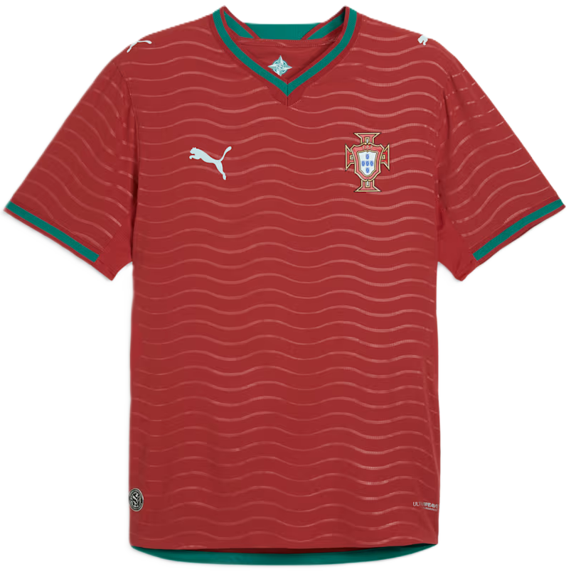 Home
Red · wave graphic · green accents
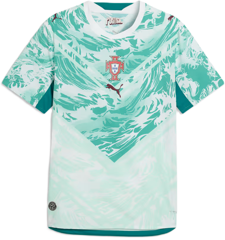 Away
Aquamarine · V-shaped graphic · Connecting Heroes
Original Fanorate review based on publicly reported kit details and football history; AI-assisted and fact-checked against public sources. Official Puma/FPF kit photos are copyrighted and not embedded.
Portugal
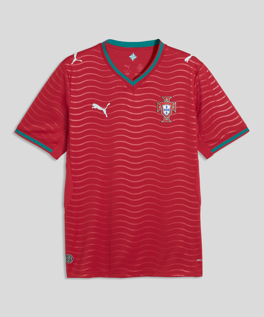
Portugal Home Jersey 2026 (Replica)
Portugal Store (FPF)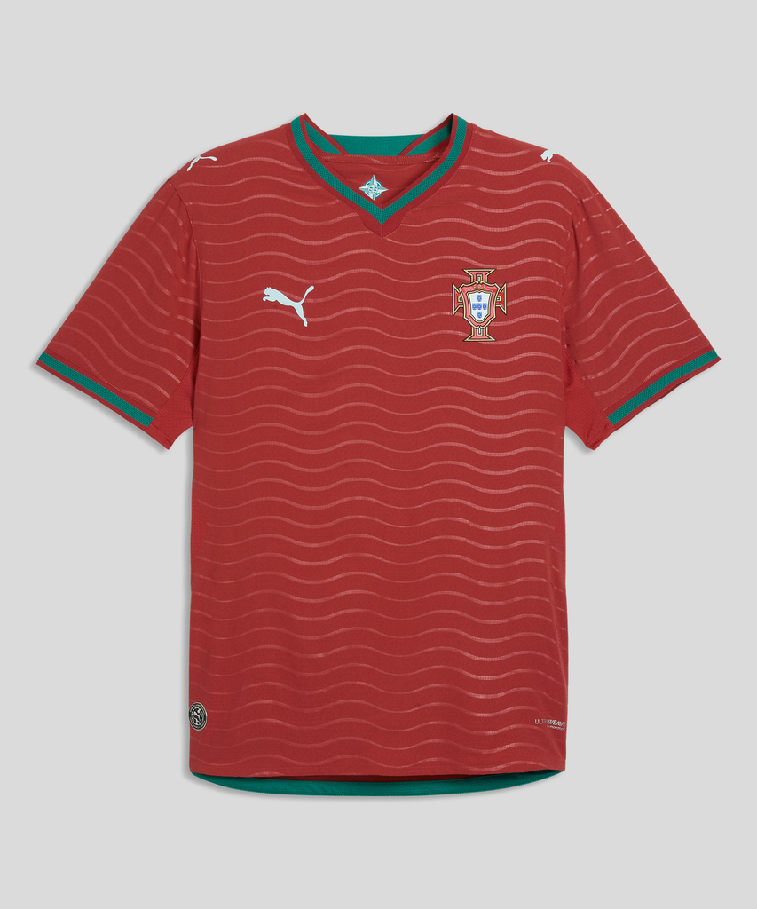
Portugal Authentic Jersey 2026
Portugal Store (FPF)One of football’s most talented squads, dressed in the sea.
Portugal arrive at World Cup 2026 with one of football’s most talented squads and, possibly, the final tournament of an era-defining career in their ranks. The Seleção have spent the last decade as serial contenders, and their kit now comes with a fresh signature: Puma, leaning into the one theme that runs through Portuguese identity more than any other — the sea.
It’s a fitting muse. This is a nation built on the ocean, a land of explorers and surfers and centuries of maritime history. Puma turned that into a two-kit story: waves on the red home, deep aquamarine on the away. The result is one of the more thoughtful concept sets of the tournament.
The colour of a golden generation
The Seleção red is the colour of a golden generation that finally broke through. The shirt has to look like a contender — and Puma’s choice to root it in Portugal’s maritime soul gives it meaning beyond the badge.
The kit at a glance
- Nation
- Portugal UEFA
- Manufacturer
- Puma
- Home kit
- Predominantly red Green collar and cuff accents; subtle wave-inspired graphic representing the sea and Portugal's maritime history
- Away kit
- Predominantly aquamarine V-shaped graphic blending shades of aquamarine and white; theme "Connecting Heroes"
- Release window
- Home Dec 3, 2025 Away Mar 20, 2026 (check official pages for exact dates)
- Design theme
- The sea Monochromatic waves on the home, V-shaped silhouette on the away
- Technology
- Puma ULTRAWEAVE Lightweight performance chassis
(Details per public reporting from nss sports, Footy Headlines and Goal — see sources.)
Modern and meaningful at once
The home shirt is classic Seleção red, but with a quiet sophistication — a subtle wave graphic rolls across the fabric, evoking the Atlantic, framed by Portugal’s traditional green on the collar and cuffs. It reads modern and meaningful at once.
The away shirt is the bolder statement: a striking aquamarine with V-shaped cuts blending sea tones and white. It’s fresh, oceanic, and unlike the usual white or black change kits.
The sea as a shared thread
Both kits orbit the sea — Portugal’s defining natural element and the engine of its history of exploration. Waves on the home, a V-shaped oceanic silhouette on the away. It’s a coherent, culturally rooted concept that few rival nations match.
Red lineage, bold new chapter
-
'16
Euro 2016
The red shirt in which Portugal won their first major trophy (Euro 2016) — a modern Seleção icon.
-
Recent
Recent cycles
Portugal kits have generally kept the classic red with green accents; the 2026 sea concept adds fresh storytelling, and the aquamarine away is among their boldest changes.
-
'26
The 2026 set
The 2026 home continues the proud red lineage; the away charts new colour territory.
The wider buzz
Football Fashion & Streetwear Appeal
The aquamarine away is a natural fashion piece — that sea tone is distinctive and pairs well with neutrals. The red home wears well casually too. Strong lifestyle crossover for a fanbase that travels well.
Player Look & Iconic-Moment Potential
Portugal’s elite attackers in red — or in that eye-catching aquamarine — will produce memorable images, and any deep run carries the emotional weight of a possible last dance for a global icon. A decisive goal in either shirt would be instantly immortalized.
Fan Reactions & Social Buzz
Expect appreciation for the sea concept, debate over the bold aquamarine, and huge emotional interest tied to the squad’s superstar. The maritime theme is ripe for shareable explainers.
Manufacturer Analysis: Puma in 2026
Puma’s 2026 program leans into culturally specific storytelling (Portugal’s sea, and similar concepts across its federations) on the lightweight ULTRAWEAVE chassis. Portugal is one of its flagship narratives this cycle.
Materials, Technology & Performance
Puma’s ULTRAWEAVE chassis targets lightweight speed and comfort. Confirm exact fabric, fit (replica vs. authentic) and any sustainability claims on official pages before buying.
Heritage in the details
The armillary sphere
The armillary sphere on Portugal’s flag is a maritime navigation instrument — fitting for a sea-themed kit.
Euro 2016 glory
Portugal won their first major international trophy at Euro 2016, in red.
Golden generation
Portugal’s footballing identity blends a small nation’s pride with a golden generation of global stars.
On the home shirt, the all-over graphic isn’t decorative noise — it’s a wave pattern representing the Atlantic and Portugal’s maritime history, visible only on a close look.
What’s the keeper?
The aquamarine away is the standout collectible — distinctive colourway, strong concept. The red home holds steady value, boosted by the new Puma era and the squad’s superstar appeal. Authentic versions and star namesets lead resale.
Three ways to wear it
- Casual: Aquamarine away + neutral trousers + clean white sneakers.
- Matchday: Red home with a green or red cap; classic Seleção look.
- Modern: The away shirt under a light overshirt for an elevated fit.
Honest verdict:
Home
For the meaningful, classic red.
Away
For the bold aquamarine and the more distinctive collectible.
Both
For the full sea concept and the new Puma era.
Portugal open a new Puma era at World Cup 2026 with a collection as deep as the ocean that inspired it. The home shirt is classic Seleção red, enriched by a subtle wave graphic and the nation’s maritime soul. The away is the brave one — an aquamarine “Connecting Heroes” design that stands out across the tournament. Confident, cultured and concept-driven, it’s a fitting wardrobe for a squad chasing one more golden moment.
